Flow Box — Brand System Proposal
Flow Box · Brand System Proposal

Your Brand,
Production-Ready

We've reviewed all your Flow Box materials and identified a clear path to a complete, consistent brand system — built on the strong visual direction you already have.

ClientAlyssa Zallie
ProjectFlow Box
ScopeBrand System
Prepared bySHTONDA.DESIGN

Where the current document falls short

Your brand document shows a clear aesthetic instinct — the right colors, the right feeling. What it's missing is the technical infrastructure that makes it executable across all your materials, now and in the future.

01
Color palette is digital-only — no print values
The palette contains only HEX codes. Lavender and purple tones are among the most difficult families to reproduce in print — the gap between RGB (screen) and CMYK (manufacturing) can be dramatic. Without calibrated print values, the color on your physical box may look noticeably different from what you see on screen.
Critical for production
02
Logo mark needs a complete system
The wave concept is strong and reads well. But a single version isn't enough. Across your packaging materials you'll need: a version for dark backgrounds, a single-color version for embossing on PS plastic, and minimum size rules so it stays readable on a small label or sticker. Without these, each new material becomes a guessing game.
Critical for production
03
Visual direction needs to be aligned
The original project brief described a playful, trend-forward Y2K aesthetic. The brand document you shared describes something clean, minimal, and premium — no text on packaging at all. These are two completely different visual systems. Before any design work moves forward, we need to align on which direction is the true Flow Box.
Critical — blocks all work
04
Typography needs validation for packaging
Cormorant Garamond + Poppins are solid starting points. But for your project we'd want to confirm: the commercial license covers printed packaging, fonts render correctly at small sizes on card stock and plastic labels, and the pairing matches the final aesthetic direction you choose.
Needs validation
05
No color hierarchy — five colors, no rules
Which is primary? Which is accent? Which is background? Without hierarchy, every new material requires a fresh judgment call — and over time, inconsistencies compound across your insert cards, manual, social posts, and future products.
Needs structure
06
Icon system described — but doesn't exist as files
The flowers, waves, hearts, and fruit are described beautifully in the document. But they don't exist as actual illustration files with a consistent stroke weight and style. Until they do, they can't be used on any material.
Needs creation
07
No real-world application examples
A complete brand guide shows the brand in context — on the box, on the insert card, on a sticker. Without mockups, it's rules without proof. Any new material has to be designed without a reference for what "right" looks like.
Missing proof

The Brand System We'll Build

We're not starting over. Everything you've already defined — the color direction, the wave mark, the icon language, the premium feel — is staying. We're refining and completing it into a production-ready system that stays consistent across every material, now and in the future.

Deliverable 01
Logo Refinement + Finalization
We'll present 2 refined directions for your existing wave mark — sharpening the details and exploring variations. After approval, we build the complete system: full color, dark background, emboss version, B&W. Usage rules, safe zone, minimum sizes, file exports in all formats.
Deliverable 02
Print-Calibrated Color Palette
Every color defined in HEX, RGB, and CMYK — calibrated specifically for the challenges of printing lavender and purple tones on packaging materials. Color hierarchy defined: primary, accent, neutral.
Deliverable 03
Icon System + Pattern
Flowers, waves, hearts, fruit — created as a unified illustration set with consistent stroke weight and style. One seamless pattern for use on the box and insert cards.
Deliverable 04
Typography System
Font pairings tested and confirmed for packaging. Commercial licenses verified. Usage rules for headings, body text, and labels across all print and digital contexts.
Deliverable 05
Brand Guidelines PDF + Mockups
Everything compiled into a single brand guidelines document. Mockups showing the brand on the box and insert cards. Full file package in AI, SVG, and PNG — ready for any future use.

We've Done This Before

Two projects from our portfolio that are directly relevant to Flow Box — one by color and emotional direction, one by product type.
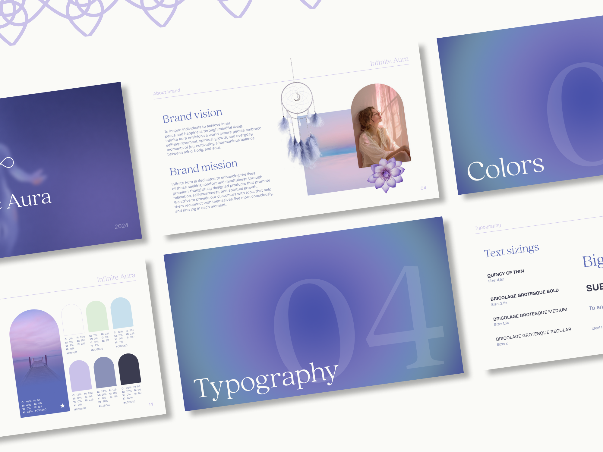
Infinite Aura branding
Case 01 · Wellness brand
Infinite Aura
Full brand identity for a wellness brand built around lavender, purple, and soft botanical aesthetics — nearly identical color territory to Flow Box. Included logo system, complete color palette with CMYK values, typography, pattern design, and brand guidelines.
Lavender palette Full brand system Packaging mockups Pattern design
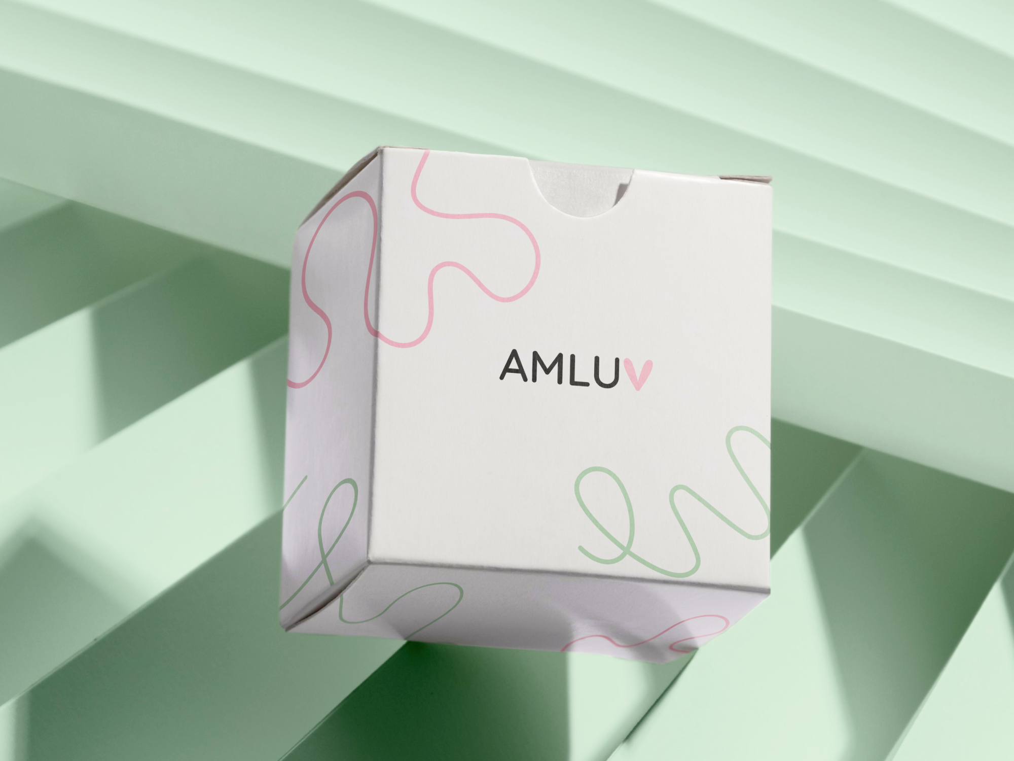
AMLUV packaging
Case 02 · Product packaging
AMLUV
Brand identity and packaging design for a physical box product — the same product category as Flow Box. Full brand system from moodboard to guidelines, including logo, pastel palette, and complete packaging mockups designed to work for any future designer picking up the project.
Box packaging Brand guidelines Pastel palette Same category

What It Costs

One flat investment covers everything — direction, logo refinement, color system, icons, typography, brand guidelines, and all final files. No hidden extras, no per-revision charges.

Standard branding from scratch
$1,700
Full brand built from zero — research, concept, logo from scratch, full identity system.
Your price — built on existing work
$875
You already have direction, a logo concept, and a color vision. We refine and complete — not rebuild.
Save $825
Everything included
One package, one price
The brand guide pays for itself across the insert cards, manual, and outer packaging you're already planning — every future material gets faster and cheaper to execute.
2 logo refinement directions + finalized system
Print-calibrated color palette (HEX + RGB + CMYK)
Icon set (flowers, waves, hearts, fruit) + seamless pattern
Typography system with licensing confirmation
Brand guidelines PDF + file package (AI, SVG, PNG)

What happens, step by step

Stage Options Feedback rounds What you receive
01 · Logo refinement 2 up to 3 2 refined logo directions + finalized system
02 · Color + typography 2–3 1 Palette with print codes + font system
03 · Graphic elements 1–2 Icon set + seamless pattern
04 · Brand guide + files 1 up to 2 Guidelines PDF + full file package

How We Move Forward

01
Align on direction
The single most important decision right now: does Flow Box lean minimal-premium, or does it keep some of the playful energy? This one answer shapes every design decision that follows. We'd love to hear your instinct on this call.
02
We send you the agreement
Immediately after this call, we'll send a simple project agreement confirming scope, timeline, and payment. Everything in writing before we start.
03
Brand system slots into existing workflow
We're already working on the Flow Box materials. The moment the brand guide is approved, every future material — insert cards, manual, outer packaging, social, website — gets faster and cheaper to execute, because all the key decisions are already made.

Let's build Flow Box the right way

One call, one decision — and we'll have an agreement to you the same day.